Mapping affinities: Towards an ethical approach to network visualization
September 27, 2021
Our personal and professional lives are deeply embedded in a complex web of interconnected and interrelated ties. These networks and our position within them can influence the way in which we live and think
In his new book available in open access – Mapping Affinities: Democratizing Data Visualizations (Mētis Presses) – Dario Rodighiero (Harvard University) challenges some common assumptions about the visual representation of networks.
In his pursuit of human-centered data visualizations, Rodighiero relies on Natural Language Processing and uses language to develop alternative metrics with a keen eye for ethics. Two examples discussed in his new book illustrates this point quite nicely.
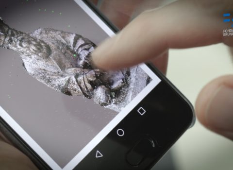
The first example is constituted by the COVID-19 cartography – winner in the “Best DH Data Visualization” category at Digital Humanities Awards 2020 – and by its latest 3D adaptation presented at Ars Electronica this month. The concept is simple. Scholars that work on a given topic are arranged in the space on the base of linguistic similarities. The closer two researchers appear in the cartography, the more they tend to talk about similar things in a similar way. A list of the most relevant words is available for each author and the most shared verbal units appear directly in the representation. Contour lines are then used to graphically represent the relevance of the scholars within the considered community of practice. While common metrics like citation counts or the h-index tend to underrepresent the importance of latest publications and of younger researchers, Rodighiero’s cartographies allow a more horizontal representation of the reality. Indeed, in principle scholars can find themselves in the cartography and explore their lexical neighborhood discovering existing and potential affinities they were not even aware of.
The second example is the use of cartographic projection to draw spherical representations of networks. Classically, a network is represented on a flat surface. However, this visualization method – jokingly addressed as “flat-network conspiracy” by Rodighiero – is not without consequences. To fit a network in a flat and framed space implies the necessity to arbitrarily attribute centrality to a group of nodes while pushing others to an artificially created periphery. It is an act of power with the potential to marginalize minorities. By drawing networks on a spherical surface, Rodighiero is therefore redefining the concepts of center and periphery in network visualizations.
So what is next? Where is the ethical data visualization heading from here? When asked about future developments in this growing field, Rodighiero says that it will be a matter of “visual grammar” and “visual literacy”. On one side, he says, it is necessary to “design new and more appropriate data visualization strategies” to tackle the issues at hand. On the other, this technical development needs to be anchored to everyday life by introducing the “interpretation of visualization in school curricula”.
“When it comes to data, Rodighiero demonstrates that the word “democracy” implies a multi-faceted approach to mapping and visualization : an approach built upon scrutinizing data sets with a critical and creative eye; understanding visualization as a complex, interactive form of storytelling ; and attending to the differing audiences and modes of engagement that a given data visualization strives to accommodate” — from the preface, by Jeffrey Schnapp, Founder and faculty director of metaLAB(at)Harvard; Carl A. Pescosolido Professor of Romance Languages and Litera-tures and of Comparative Literature; Faculty co-directorof Berkman Center for Internet and Society; Affiliate of the Department of Architecture at the GSD.
The author/s

-
 Dario Rodighiero
Dario Rodighiero is a postdoc of the metaLAB, a design-driven laboratory for experiments in the arts and humanities at Harvard University. He is also affiliated with the Berkman Klein Center for Internet & Society and the Bibliotheca Hertziana in Rome. Rodighiero is also a lecturer in Paris at Pantheon-Sorbonne University, teaching data visualization and controversy mapping. Presently he works on Surprise Machines, a museum project to exhibit the entire collection of the Harvard Art Museums through a choreographic interface capable of capturing body gestures. He is an alumnus of MIT as well as of EPFL, which awarded him a PhD in Science after attending the doctoral program of Architecture and Sciences of the City. As a member of Bruno Latour’s AIME project, Dario was a finalist of ADI Compasso d’Oro Award 2020. Formerly he was employed at Sciences Po and the European Commission, which recently appointed him as an external expert in data visualization and interface design.
MORE INFO